Designed a multi-view Power BI dashboard that lets government agencies and policymakers explore spatial, temporal, and environmental patterns in Wisconsin traffic accidents, from a dataset of 7.7 million national records.
Wisconsin traffic crash data is publicly available but not publicly usable. The raw dataset contains 7.7 million accident records nationwide (Feb 2016 to March 2023), but no tool existed for policymakers to slice, filter, and compare crash patterns at the state level.
We filtered it down to 34,688 Wisconsin-specific records and designed a dashboard that answers four research questions government agencies actually care about: spatial clustering, temporal peaks, infrastructure influence, and weather impact.
Transportation departments and emergency services need to make resource allocation decisions: where to add signals, when to deploy crews, which road types need attention. But the data they had was a flat CSV with millions of rows.
Three design challenges:
1. Scale vs. clarity. 34,688 dots on a map is noise. Users needed ways to filter by
county, severity, road type, and time period without losing the spatial overview.
2. Multiple analytical lenses. A single chart can't answer "where, when, why, and
how bad?" simultaneously. The dashboard needed distinct views for spatial, temporal, infrastructure,
and weather analysis.
3. Audience range. Both data-literate analysts and non-technical policymakers
needed
to extract insights without training.
The finished dashboard gives users interactive access to Wisconsin crash patterns across four dimensions, with cross-filtering that connects every view.
The source dataset covered the entire US. I used Python to filter down to Wisconsin records (34,688 out of 7.7M) and created new categorical columns for analysis: time-of-day classification (Morning Commute, Daytime, Evening Commute, Evening, Late Night), weather categories (grouping dozens of raw weather strings into 7 meaningful buckets), and severity tiers.
Inside Power BI, I wrote custom DAX formulas to create calculated fields that the raw data didn't provide. Time Classification mapped each crash hour to a commute period. Weather Category consolidated 50+ raw weather condition strings into 7 actionable groups (Clear, Cloudy, Rain, Snow, Thunderstorms, Icy, Unknown). These computed fields became the backbone of every filter and chart in the dashboard.
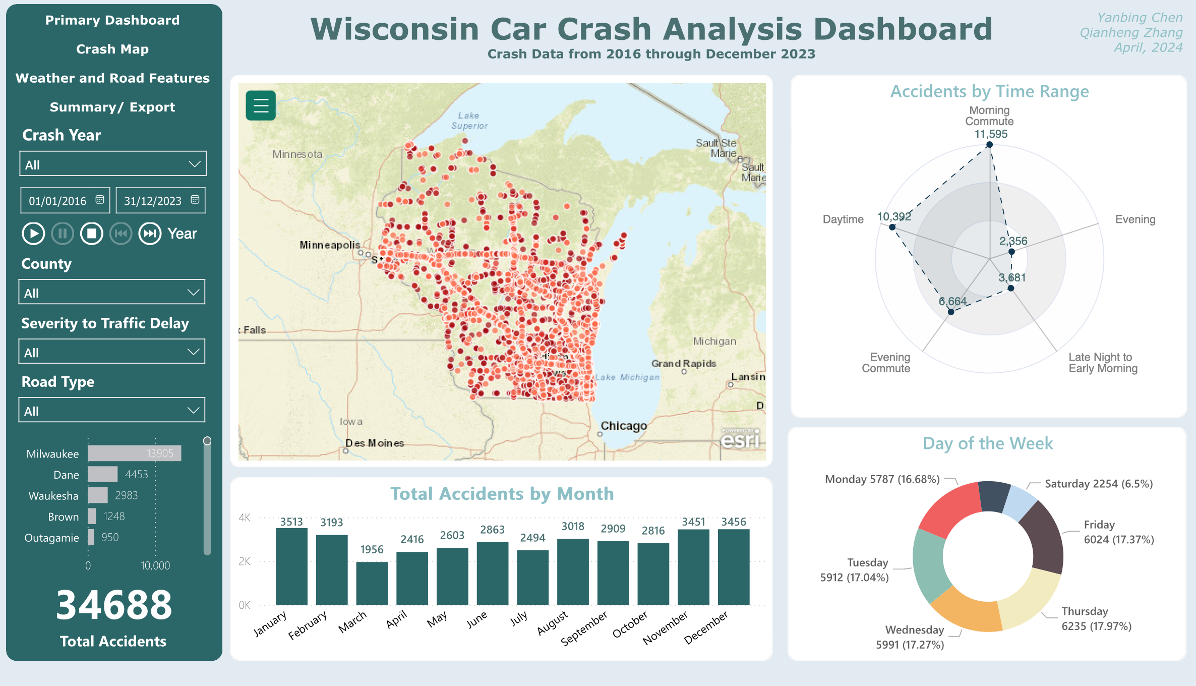
The main view centers on a dot-density map of all 34,688 crash locations, flanked by a radar chart (accidents by time range) and a donut chart (day of week distribution). A bar chart at the bottom shows monthly trends. The left panel provides global filters: year range, county, severity, and road type. Every chart cross-filters the others, so clicking "Milwaukee" on the map updates all temporal views instantly.
Primary view: spatial overview with temporal breakdowns and global filters
The second view zooms into road infrastructure. A heatmap replaces the dot map to show crash density at lower zoom levels. Paired with a sunburst chart breaking down road type and street name, and a horizontal bar chart ranking the most dangerous specific roads. This view answers the infrastructure question: are crashes clustering on US highways, state highways, interstate highways, or local roads?
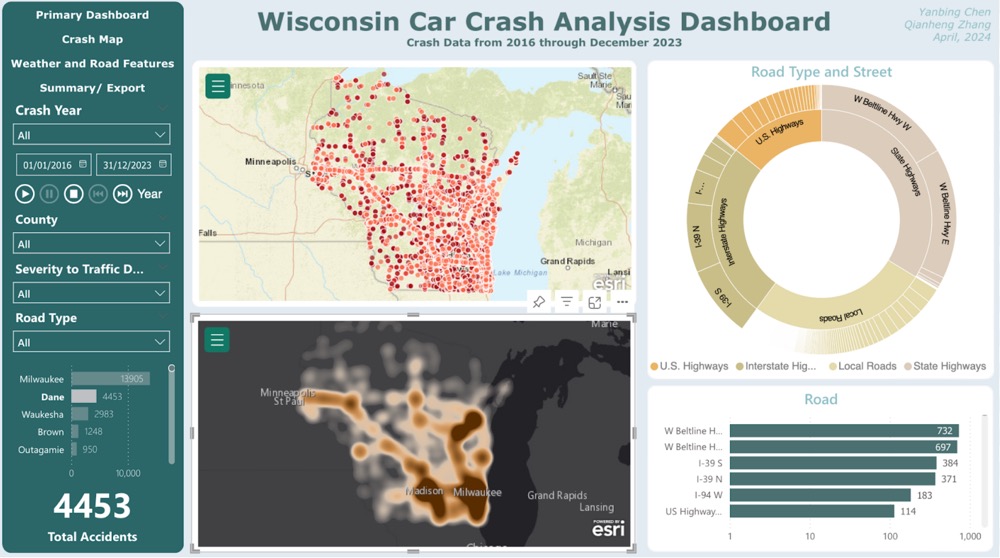
Crash map: heatmap density with road type sunburst and street-level ranking
The third view brings environmental context. Temperature and visibility gauges sit at the top. Below, stacked bar charts show the presence of nearby road features (crossings, traffic signals, junctions, stops) at crash sites. A donut chart breaks down weather conditions at the time of each crash. The finding that stood out: 64% of crashes happened in clear weather, challenging the assumption that bad weather is the primary driver.
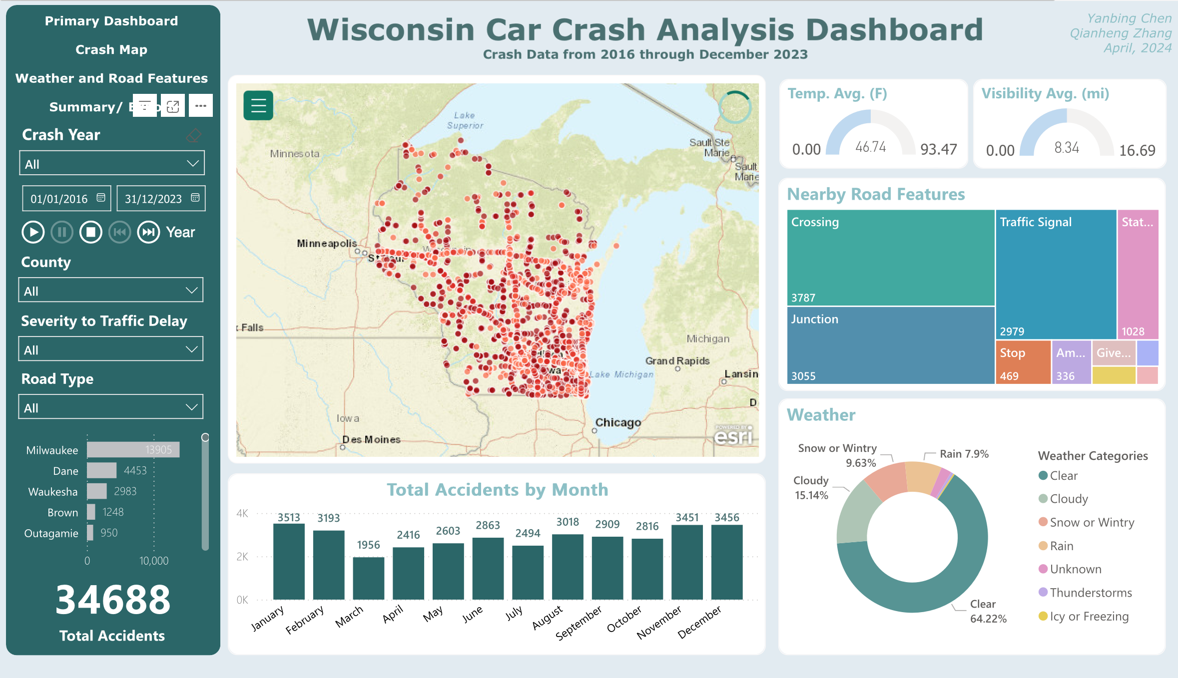
Weather and road features: environmental conditions at crash sites
The fourth view provides a summary table with export capability. Policymakers can filter down to a specific county, time period, or severity level, then export the filtered data for their own reports. This was a deliberate design choice: the dashboard is a starting point for analysis, not the final report itself.
The primary view uses a dot map because individual crash locations matter for spatial pattern recognition. But 34,688 dots create overplotting at the state level. The crash map view switches to a heatmap for density at lower zoom levels. One tradeoff we hit: Power BI's published reports cap at 30,000 map points, so the dot map only renders fully in the desktop version. The online version degrades gracefully with heatmap as fallback.
A bar chart could show accidents by time range, but a radar chart makes the cyclical nature of time visible. You can immediately see that daytime and evening commute are the peak periods, with late night as the trough. The circular layout maps naturally to a 24-hour clock metaphor.
Rather than building separate dashboards for each question, all charts in each view are cross-filtered. Click a county on the map and the time distribution updates. Select "Snow" in the weather chart and the map shows only snow-condition crashes. This keeps the interface simple for non-technical users while supporting deep exploration for analysts.
The dashboard looks like a visualization project, but the hardest decisions happened upstream. How to bin 50+ weather strings into meaningful categories. How to classify time periods that match how transportation departments actually think (commute vs. off-peak, not arbitrary hour blocks). Getting the data model right made every downstream chart trivially easy to build. Getting it wrong would have made the whole dashboard misleading.
The 30,000-point limit for published Power BI reports wasn't something we could negotiate. It forced a better design: a heatmap fallback that actually communicates density more effectively than 34,688 overlapping dots.
The 64% clear-weather crash finding challenges the gut assumption that bad weather equals more crashes. A well-designed dashboard surfaces patterns at people didn't expect, and that's where policy changes could actually start.